STARBUCKS brand TRAINING
Starbucks BRAND Training
1 Global Brand. 400,000+ Partners. Same Roast. Same Cup.
UX Design & Strategy
Visual Design
Advanced Gamification
OBJECTIVE
Starbucks has invested millions in creating a world-class brand, complete with comprehensive brand guidelines, mission, values, and brand promises. These guidelines provide over 400,000 global Partners with detailed instructions on using brand assets like logos, photography, and other visual elements, along with defining the brand's mission and values.
However, extensive research and Partner feedback revealed a significant challenge: Partners needed more support in bridging the gap between theoretical knowledge and practical application. They required guidance on how to critically understand and apply these principles in real-world scenarios – ensuring a customer experience that’s consistently true to the Starbucks brand.
SOLUTION
In an ongoing collaboration with e collaborated with Starbucks, in conjunction with Mindspace, I helped create a world-class Global Brand Training experience that seamlessly connects the “what,” the “how,” and the “why” in a modern, engaging, and immersive format. We designed a gamified, globally-scalable training program that immerses partners – including international licensees – in the basics of the Starbucks brand. This experience provides hands-on application of the principles behind delivering the Starbucks experience in a way that aligns with, and enhances their brand promises.
Our approach was holistic, offering both digital and in-person training options. These were designed to enable partners to test their knowledge through real-world, scenario-based Retrieval Practice Activities (RPAs) – either individually or in a group setting.
Beautiful brand. Beautiful brand training.
Starbucks' success goes beyond their coffee; it’s rooted in the experiences they create in every store and through every guest interaction. We worked closely with Starbucks to design a tailored experience that reflects the essence of their brand—from beautiful UI/UX to meaningful interactions and engaging, easy-to-digest micro-learning based content.
Interaction design infused with the unexpected
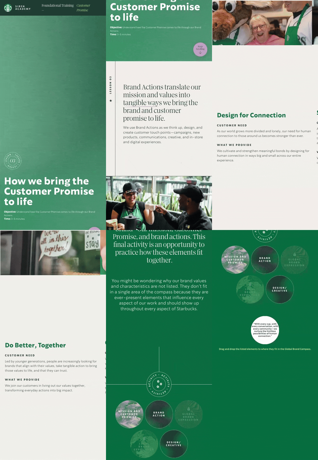
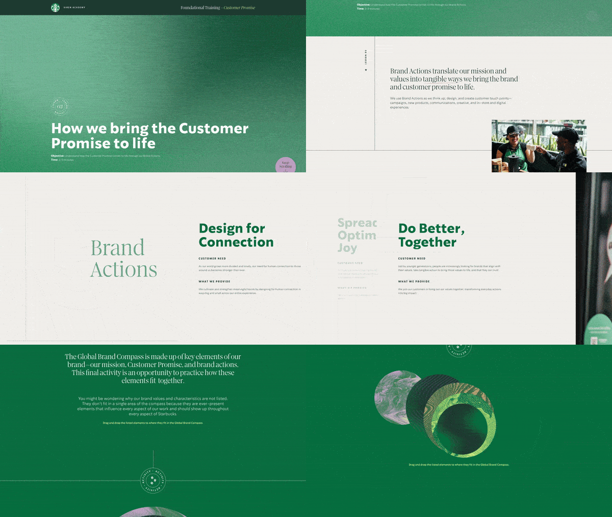
We crafted an elegant, modern, and intuitive interaction design to enhance engagement and reinforce the training material. Moving away from the traditional slide-based learning format that leads to passive clicking, our team developed a dynamic, web-based, bi-directional navigation experience. This design shifts between vertical and horizontal scrolling to highlight key content, and increase user focus and interaction.


We also transformed the 1:1 digital learning experience into an engaging, interactive, instructor-led format for larger groups. We created presentation decks for instructors that cover all of the content from the digital experience, complete with detailed speaker notes. Additionally, Mindspace adapted the digital RPAs to include collaborative, interactive group activities, ensuring that participants are actively engaged while reinforcing key concepts through hands-on, practical application.


